Looking back at your preliminary task, what do you feel you have learnt in the progression from it to the full magazine?
The preliminary task was a good way for me to understand what makes a good magazine. I looked at the front cover and contents page of real magazines and analysed them, from the analysis I saw that for magazines to attract an audience they need titles that stood out, eye catching images and cover lines/ tag lines. Designing a layout helped me to make a school magazine and the school magazine was a starting point in learning how to make a magazine, so when I moved on to creating a music magazine I could develop the magazine further, because I had a better understanding of the conventions of a magazine.
Also before starting my music magazine I did a case study of 'ok' magazine, I analysed the front cover,contents page and double page, this allowed me to work out how to create my music magazine, as I looked at the colours used, the language used and the target audience. Looking at these features helped me to make a plan for my music magazine.
After making the music magazine I developed many skills from photoshop and if I was to do the task again I would know how to make my magazine quicker and much better because I've experimented on photoshop and developed a pop music magazine. Lastly after making my music magazine I understand the magazine production process,institutions and industry a lot better and the sort of software they use to make magazines.
Friday, 25 March 2016
Thursday, 24 March 2016
Evaluation task 6
What have you learnt about technologies from the process of constructing this product?
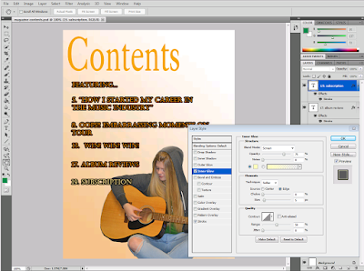
I have used different forms of software to help develop my magazine. I used "1001fonts.com" to create titles for each page. I have developed my skills through this because after the title was snipped on to Photoshop I had to cut and erase the background of the title and make it look neat. Photoshop was the main piece of software I used to develop my magazine. Using Photoshop has meant that I have developed many skills including cutting out photos and placing them on to backgrounds, exploring the effects on photoshop and also just getting used to using a range of different tools on photoshop. The magazine industry often uses software such as photoshop to edit images of celebrities for the front cover of magazines. lastly I used Google images to help choose my backgrounds for the magazine, the screenshots below show this.
I have used different forms of software to help develop my magazine. I used "1001fonts.com" to create titles for each page. I have developed my skills through this because after the title was snipped on to Photoshop I had to cut and erase the background of the title and make it look neat. Photoshop was the main piece of software I used to develop my magazine. Using Photoshop has meant that I have developed many skills including cutting out photos and placing them on to backgrounds, exploring the effects on photoshop and also just getting used to using a range of different tools on photoshop. The magazine industry often uses software such as photoshop to edit images of celebrities for the front cover of magazines. lastly I used Google images to help choose my backgrounds for the magazine, the screenshots below show this.
Evaluation task 5
How did you attract/address your audience?
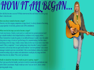
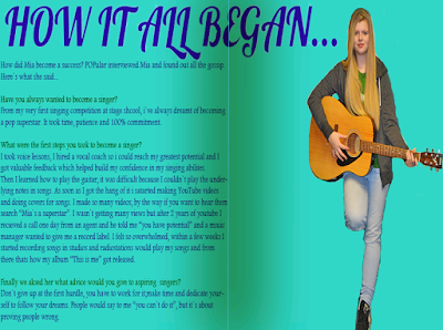
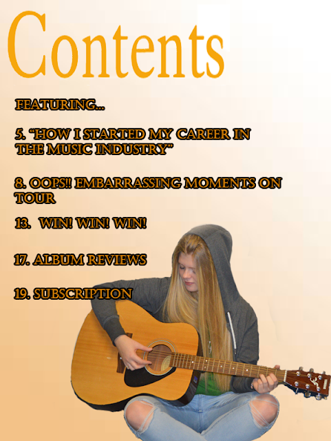
To attract my audience I used different fonts so that each page stood out and wasn't repetitive. Each font I used was a darker shade of the background colour so that it remained simple but visually appealing. In addition the colour of text was a similar colour to the background. The colours I used for the background of the magazine were unusual but this attracts the audience because its not common to see pop music magazines with orange and turquoise pages. The font on the contents page stands out because I used an outer glow shadow so the writing doesn't look flat, this allows the audience to be attracted to the magazine so that they`ll continue to read on.The images of all three pages have been brightened and the contrast has been changed to enhance the magazine, so therefore the audience can be attracted. The content on the front cover attracts the audience because there are many cover lines which inform the reader on what the magazine is about. Also to address the audience the content on the double page is about an interview, so the information is entertaining and informing.
To attract my audience I used different fonts so that each page stood out and wasn't repetitive. Each font I used was a darker shade of the background colour so that it remained simple but visually appealing. In addition the colour of text was a similar colour to the background. The colours I used for the background of the magazine were unusual but this attracts the audience because its not common to see pop music magazines with orange and turquoise pages. The font on the contents page stands out because I used an outer glow shadow so the writing doesn't look flat, this allows the audience to be attracted to the magazine so that they`ll continue to read on.The images of all three pages have been brightened and the contrast has been changed to enhance the magazine, so therefore the audience can be attracted. The content on the front cover attracts the audience because there are many cover lines which inform the reader on what the magazine is about. Also to address the audience the content on the double page is about an interview, so the information is entertaining and informing.
Evaluation task 4
Who would be the audience for your magazine?
The target audience for my magazine is mainly females between the ages of 13-22 and is aimed at all ethnicities. The older readers who may have just left university would have an income of just over £20,000. However the teenage audience could have part time jobs, although their income would be rather low, this means that teenagers have less disposable income so they can`t buy as many luxuries; including magazines as the older readers. The hobbies and interests of the target audience would be an interest in modern pop music such as Taylor Swift https://www.google.co.uk/url?sa=t&rct=j&q=&esrc=s&source=web&cd=1&cad=rja&uact=8&ved=0ahUKEwiv6ZmWwdnLAhVLXRoKHZLnAuAQyCkIHzAA&url=https%3A%2F%2Fwww.youtube.com%2Fwatch%3Fv%3DAgFeZr5ptV8&usg=AFQjCNHD3KdfWsjHUa4YeW4b5mXj-OcV7Q&sig2=R43LzWSV9reJD5FAudFTbg ,instruments and hanging out with friends. The fashion of the audience would be inspired by celebrities in pop magazines, so generally in season and hair and make-up would be based on outfits and celebrity looks.
The target audience for my magazine is mainly females between the ages of 13-22 and is aimed at all ethnicities. The older readers who may have just left university would have an income of just over £20,000. However the teenage audience could have part time jobs, although their income would be rather low, this means that teenagers have less disposable income so they can`t buy as many luxuries; including magazines as the older readers. The hobbies and interests of the target audience would be an interest in modern pop music such as Taylor Swift https://www.google.co.uk/url?sa=t&rct=j&q=&esrc=s&source=web&cd=1&cad=rja&uact=8&ved=0ahUKEwiv6ZmWwdnLAhVLXRoKHZLnAuAQyCkIHzAA&url=https%3A%2F%2Fwww.youtube.com%2Fwatch%3Fv%3DAgFeZr5ptV8&usg=AFQjCNHD3KdfWsjHUa4YeW4b5mXj-OcV7Q&sig2=R43LzWSV9reJD5FAudFTbg ,instruments and hanging out with friends. The fashion of the audience would be inspired by celebrities in pop magazines, so generally in season and hair and make-up would be based on outfits and celebrity looks.
Evaluation task 3
What kind of media institution might distribute your magazine and why?
Bauer media group is a European based media company. The group is a worldwide media empire offering over 300 magazines in 15 different countries. In the UK there are two divisions of the Bauer media group because Bauer is a sister company of H Bauer publishing. Bauer media might distribute my magazine because they distribute magazines such as " Heat and Grazia". These magazines have similar features to my magazine which include: Fashion, celebrity gossip and music. These are well known pop magazine features. Also Bauer media has a wide portfolio of influential brands which distribute different genres of magazines, from music to sports to motoring. This allows audiences to connect to content through different platforms of brands.
Bauer media group is a European based media company. The group is a worldwide media empire offering over 300 magazines in 15 different countries. In the UK there are two divisions of the Bauer media group because Bauer is a sister company of H Bauer publishing. Bauer media might distribute my magazine because they distribute magazines such as " Heat and Grazia". These magazines have similar features to my magazine which include: Fashion, celebrity gossip and music. These are well known pop magazine features. Also Bauer media has a wide portfolio of influential brands which distribute different genres of magazines, from music to sports to motoring. This allows audiences to connect to content through different platforms of brands.
Wednesday, 23 March 2016
Evaluation task 2
How does your magazine represent a particular social group?
My magazine represents a teenage social group because the front cover includes typical features of a pop music magazine for example interviews, top songs and style advice.I have decided to use this social group because pop culture is well known to be associated with teenage girls and young women.
My magazine represents a teenage social group because the front cover includes typical features of a pop music magazine for example interviews, top songs and style advice.I have decided to use this social group because pop culture is well known to be associated with teenage girls and young women.
Tuesday, 22 March 2016
Evaluation task 1
In what ways does your magazine use, develop or challenge forms and conventions of real magazines?
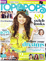
My magazine uses some features of real magazines, when researching magazines of "pop" genre; the conventions of the magazine would include an eye catching title usually of a bright colour, cover lines, and a picture of a celebrity for the front cover. Following my research i decided to use the forms of real magazines to create my own based on the genre. "Billboard" magazine uses one celebrity for the front cover i used this as inspiration to make my front cover similar and i placed the image of my model in the center of the page, the effect of this is that it stands out for the audience. Both "Smash Hits and Top of the pops" use bold titles and cover lines so i was able to use this as a guideline to create my magazine. The only difference with my magazine that possibly challenges the form of pop magazines is that my model uses an acoustic guitar was used for the front cover and usually guitars are seen on rock music magazines and not on modern day pop magazines.
My magazine uses some features of real magazines, when researching magazines of "pop" genre; the conventions of the magazine would include an eye catching title usually of a bright colour, cover lines, and a picture of a celebrity for the front cover. Following my research i decided to use the forms of real magazines to create my own based on the genre. "Billboard" magazine uses one celebrity for the front cover i used this as inspiration to make my front cover similar and i placed the image of my model in the center of the page, the effect of this is that it stands out for the audience. Both "Smash Hits and Top of the pops" use bold titles and cover lines so i was able to use this as a guideline to create my magazine. The only difference with my magazine that possibly challenges the form of pop magazines is that my model uses an acoustic guitar was used for the front cover and usually guitars are seen on rock music magazines and not on modern day pop magazines.
Friday, 18 March 2016
Friday, 11 March 2016
Friday, 4 March 2016
Subscribe to:
Comments (Atom)
