To attract my audience I used different fonts so that each page stood out and wasn't repetitive. Each font I used was a darker shade of the background colour so that it remained simple but visually appealing. In addition the colour of text was a similar colour to the background. The colours I used for the background of the magazine were unusual but this attracts the audience because its not common to see pop music magazines with orange and turquoise pages. The font on the contents page stands out because I used an outer glow shadow so the writing doesn't look flat, this allows the audience to be attracted to the magazine so that they`ll continue to read on.The images of all three pages have been brightened and the contrast has been changed to enhance the magazine, so therefore the audience can be attracted. The content on the front cover attracts the audience because there are many cover lines which inform the reader on what the magazine is about. Also to address the audience the content on the double page is about an interview, so the information is entertaining and informing.
Thursday, 24 March 2016
Evaluation task 5
How did you attract/address your audience?
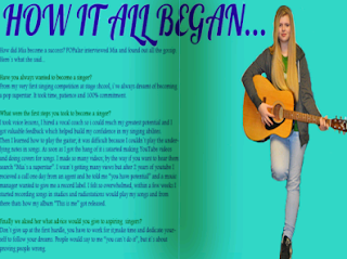
To attract my audience I used different fonts so that each page stood out and wasn't repetitive. Each font I used was a darker shade of the background colour so that it remained simple but visually appealing. In addition the colour of text was a similar colour to the background. The colours I used for the background of the magazine were unusual but this attracts the audience because its not common to see pop music magazines with orange and turquoise pages. The font on the contents page stands out because I used an outer glow shadow so the writing doesn't look flat, this allows the audience to be attracted to the magazine so that they`ll continue to read on.The images of all three pages have been brightened and the contrast has been changed to enhance the magazine, so therefore the audience can be attracted. The content on the front cover attracts the audience because there are many cover lines which inform the reader on what the magazine is about. Also to address the audience the content on the double page is about an interview, so the information is entertaining and informing.
To attract my audience I used different fonts so that each page stood out and wasn't repetitive. Each font I used was a darker shade of the background colour so that it remained simple but visually appealing. In addition the colour of text was a similar colour to the background. The colours I used for the background of the magazine were unusual but this attracts the audience because its not common to see pop music magazines with orange and turquoise pages. The font on the contents page stands out because I used an outer glow shadow so the writing doesn't look flat, this allows the audience to be attracted to the magazine so that they`ll continue to read on.The images of all three pages have been brightened and the contrast has been changed to enhance the magazine, so therefore the audience can be attracted. The content on the front cover attracts the audience because there are many cover lines which inform the reader on what the magazine is about. Also to address the audience the content on the double page is about an interview, so the information is entertaining and informing.
Subscribe to:
Post Comments (Atom)


No comments:
Post a Comment